A serious ideological argument over fonts – what could be more German? Today’s unusual article, trawled up from the depths of Wikipedia by the Wikiworm…
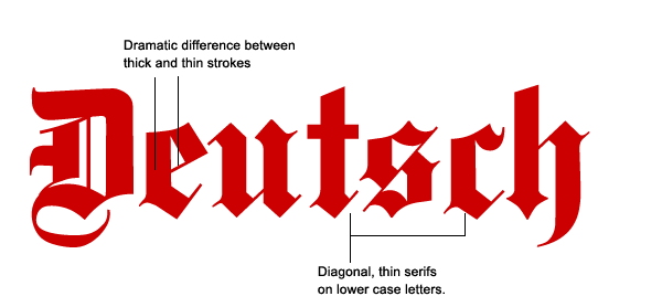
The Antiqua–Fraktur dispute was a typographical dispute that took place in 19th- and early 20th-century Germany.
In most European countries, typefaces like the German Fraktur were displaced with the creation of the Antiqua typefaces in the 15th and 16th centuries. However, in Germany, both typefaces coexisted until the first half of the 20th century.
During that time, both typefaces gained ideological connotations in Germany, which led to long and heated disputes on what was the “correct” typeface to use.
Conflict over the two typefaces first came to a head after the occupation of Germany and dissolution of the Holy Roman Empire by Napoleon in 1806, which led to a period in the history of Germany in which nationalists began to attempt to define what cultural values were common to all Germans. There was a massive effort to canonize the German national literature – for example the Grimm Brothers’ collection of fairy tales – and to create a unified German grammar.
In the context of these debates, the two typefaces became increasingly polarized: Antiqua typefaces were seen to be “un-German”, and they were seen to represent this by virtue of their connotations as “shallow”, “light”, and “not serious”. In contrast, Fraktur, with its much darker and denser script, was viewed as representing the alleged German virtues such as depth and sobriety.
 During the Romantic Era, in which the Middle Ages were glorified, the Fraktur typefaces additionally gained the (historically incorrect) interpretation that they represented the German Gothicism. For instance, Goethe’s mother advised her son, who had taken to the clear Antiqua typefaces, to remain – “for God’s sake” – German, even in his letters.
Otto von Bismarck was a keen supporter of German typefaces. He refused gifts of German books in Antiqua typefaces and returned them to sender with the statement
Deutsche Bücher in lateinischen Buchstaben lese ich nicht! (I do not read German books in Latin letters!).
The dispute between Antiqua and Fraktur continued into the 20th century. The arguments in favour of Fraktur were based not only on historical and cultural perceptions but also on the claim that Fraktur was more suited for printing German and other Germanic languages, being more readable than Antiqua for this purpose.
The Fraktur typefaces were particularly heavily used during the time of Nazism, when they were initially represented as true German script, the press scolded for its frequent use of “Roman characters” under “Jewish influence” and German émigrés urged to use only “German script”.

However, in 1941 Fraktur was banned in a Schrifterlass (edict on script) signed by Martin Bormann as so-called Schwabacher Judenlettern (“Schwabacher Jewish letters”). Surprisingly, it turned out that Adolf Hitler had a dislike for the Fraktur typeface, as demonstrated by a declaration made in the Reichstag in 1934:
Your alleged Gothic internalisation does not fit well in this age of steel and iron, glass and concrete, of womanly beauty and manly strength, of head raised high and intention defiant … In a hundred years, our language will be the European language. The nations of the east, the north and the west will, to communicate with us, learn our language. The prerequisite for this: The script called Gothic is replaced by the script we have called Latin so far …
After the Second World War the Sütterlin script was once again taught in the schools of some German states as an additional script, but it could not hold for long against the Latin cursive scripts. Since few people remain who can read Kurrent, most old letters, diaries, etc. remain inaccessible for all but the oldest German speakers. As a consequence, most German-speaking people today find it difficult to decipher their own parents’ or grandparents’ letters, diaries, or certificates.


The Frankfurters may beg to differ.
To be fair to the krauts, that logo is not very much more gothic than the New York Times one
http://news.doddleme.com/wp-content/uploads/2013/08/New-York-Times-logo.jpg
When my father was studying German in college, he wrote a letter to a German-born grandmother. She replied in a letter written in the old script. He had to take it to his professor, who said, “Ach, they don’t teach them to write like that anymore.” And that must be just as well: I and many of my classmates found learning to write in cursive trouble enough.
I do have a book printed in Munich in the 1920s in a modern face. I had never heard the modern forms referred to as “Antiqua”.
me neither – I had always known it as ‘latin’