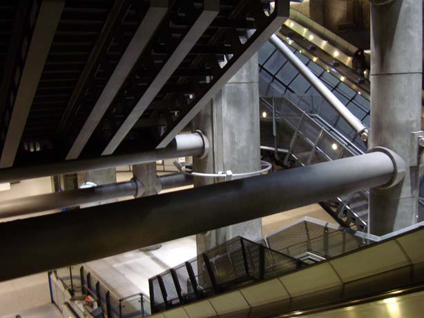
First time visitors to Westminster Underground station may think they have walked onto the set of Fritz Lang’s Metropolis on entering this subterranean cathedral of concrete, steel and chains. But such architectural gems are easily taken for granted on a daily commute. How often do we ignore wondrous feats of engineering and inspirational aesthetic style in favour of getting from A to B as quickly as possible?


Quite so Susan – it is hard to imagine that the deeply disappointing Portcullis House, which sits atop this magnificent creation, was designed by the same practice – (Michael) Hopkins. I love the fact that the architects were not tempted to ‘pretty up’ the space – to my eyes, the unrelieved Piranesian gloom of the place is the outstanding feature.
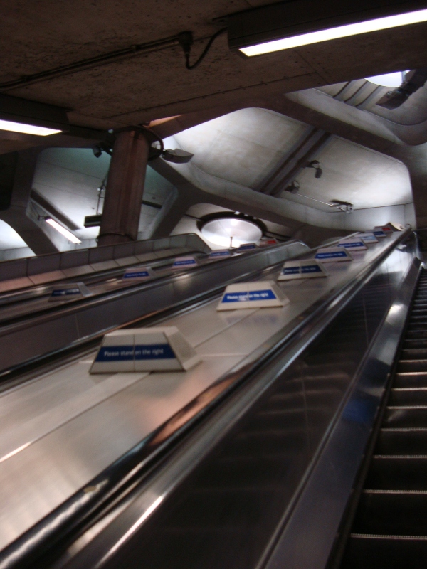
The problem for architects when designing buried stuff is that it becomes decor, the lining, the inside of the box, has an entirely different viewing platform. Entered through a hole in the ground and often arrived at on a moving staircase the experience should be theatre. From the photographs it looks like that’s what it is, if a touch Virgin Records-Blade Runnerish. The roof supports at the top of the escalator look organic, quite an achievement when using reinforced concrete. Strange how the beauty of the built environment is often taken for granted, recognition only resurrected when the threat of demolition beckons.
It is a wonderful place and I hope that tourists are impressed by it, even if they were expecting a victorian steam punk emporium with chandeliers and artful dodgers
a victorian steam punk emporium with chandeliers and artful dodgers
Yes, please.
Susan, what do you think this “inspirational aesthetic style” inspires?
For me it inspires awe, Peter. It’s partly the immense, lofty scale and asymmetry of the design, but also its industrial quality (I am a big fan of Richard Rogers’ inside-out architecture too). And I feel there’s an element of Steampunk too, Worm, but without the cogs – as if this is a giant factory, where the escalators are conveyor belts… or a journey through an engine room in the gigantic bowels of a bulk carrier. This also inspires a sense of purpose, with tube travellers each becoming small components (perhaps we are the cogs?) of a massive machine. Mahlerman’s Piranesian gloom (fabulous!) is a part of it too – and malty’s organic roof. The design is timeless – and I suppose very of the moment, in a Danny Boyle sort of way…
Underground stations, like a lot of transport architecture, are about going through; most other architecture is about going in and out and round. The Jubilee Line extension stations lead us through themselves with a sense of purpose and, yes, they do inspire awe. They are somewhat imperious in the way they guide us through – especially at Westminster and Canary Wharf. I for one feel like a very small cog in a vast machine when travelling through Norman Foster’s cavernous Canary Wharf station. There’s no disobeying it, somehow, no dodging the “wrong way” down tunnels to take shortcuts to the platform that you want, Foster’s and Hopkins’ tunnels take you the way they want you to go. That, the grandeur, the aching height of the underground spaces, and the monochrome palette, do indeed give it a Piranesian aspect, but at least there’s an escape. And for a bit of light relief one can get off at North Greenwich, where Will Alsop’s slanting blue columns are more cheerful, if also less awesome.
The new East London line stations are also impressive if in a more detailed, low-key way.
Your images remind me of the world of Sonic the Hedgehog, in a good way.
I went to an interview at the ‘House’ and really couldn’t believe how marvellous this station is.