Brit gets an eyeful of The Art of Pin-Up, TASCHEN’s comprehensive new guide to a uniquely American art form…
Men are simple creatures: show them a picture of an attractive woman in a revealing outfit and you can flog them pretty much anything, from magazines to toothpaste to joining the army. This straightforward insight was the foundation of Pin-Up – the peculiarly American phenomenon which originated in late-19th century illustrated magazines like Life and then boomed in the 1930s with Esquire covers, sumptuous full-colour advertisements and a proliferation of hugely successful girlie calendars published by the company Brown & Bigelow.
By Earl Moran (c) Brown & Bigelow
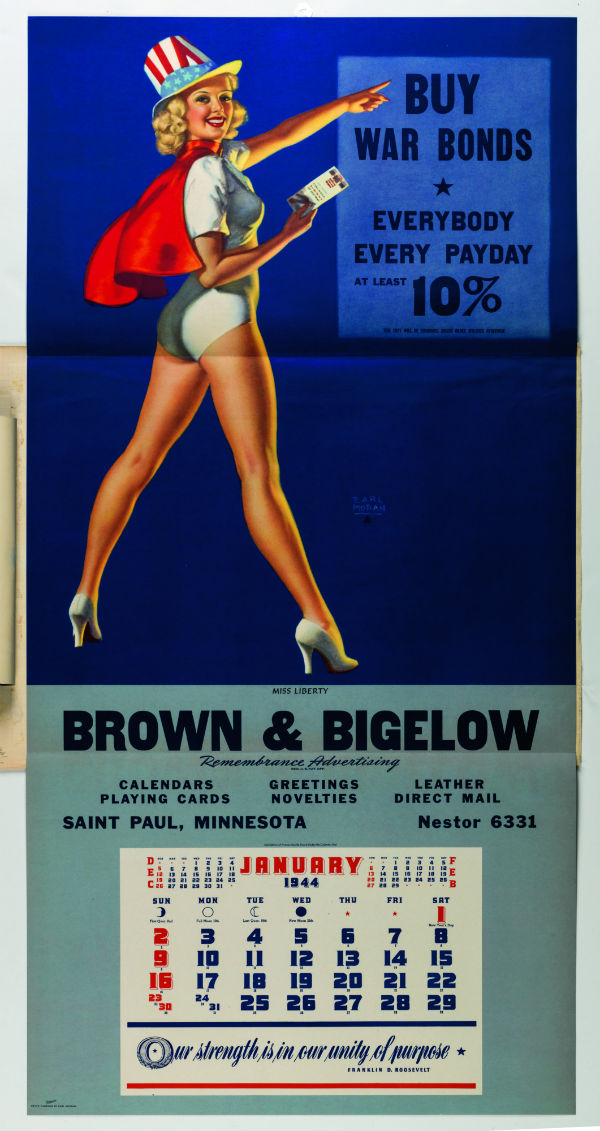
It reached a peak in the Second World War, when US servicemen stationed abroad were issued with sexy pictures along with their food rations, for the purposes of morale. In fact, the military authorities had realised the usefulness of pretty females as early as 1917 when recruiting volunteers for America’s entry into the First World War. Woodrow Wilson’s Division of Pictorial Publicity had created posters showing girls in revealing cod-military uniforms atop such masculinity-shaming slogans as Gee!! I Wish I Were a Man, I’d Join the Navy…. Be a Man and Do It! But by 1940 they’d perfected the techniques. Franklin D Roosevelt’s War Advertising Council deliberately utilised the ad industry to make propaganda, and what they made were very specific pictures of women: beautiful, idealised women who were desirable yet wholesome, sexy yet innocent, cheeky but never lewd. They were meant to remind servicemen of what they were fighting to protect – gorgeous all-American gals who waited back home – and soldiers were officially encouraged to pin them up (hence the term) in their barrack rooms and messes.
Soon these dream girls were plastered over every available surface, inside ship cabins and tanks, cockpits and submarines, even on the noses of warplanes. And when the war ended, the War Advertising Council simply became the Advertising Council and carried on using the same methods to sell virtually anything. For a while, Pin-Up was everywhere.
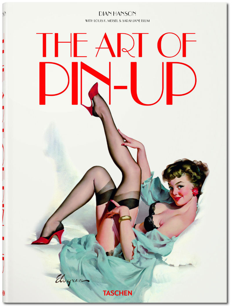
This much we learn from Dian Hanson’s witty, informative introduction to The Art of Pin-Up – a jaw-dropping new coffee table tome from TASCHEN. Indeed, The Art of Pin-Up is surely the TASCHEN tome ne plus ultra, being larger than my actual coffee table and consisting of over 500 pages of lavish illustration, collecting the finest examples of the genre.
So what exactly is that genre, and is it art? Hanson defines Pin-Up as “a provocative but never explicit image of an attractive woman created specifically for public display in a male environment.” Pin-Up is certainly not smutty – nudity is rare, and never lascivious – but it exists somewhere between very soft porn, figurative illustration and what we British would think of as seaside postcard humour. It is a genre of pop art and, as with all such, the quality varies. But amidst the formulaic and the mediocre there can be found a small number of practitioners who transcend the generic and deserve to be recognised as real artists.
By Rolf Armstrong (c) Brown & Bigelow
The Art of Pin-Up focuses on ten of the most outstanding Pin-Up painters, each of whom had his (or in one case, her) unique style. Contrast the elegant, elongated Art Deco goddesses of Rolf Armstrong’s works [above] with the silly postcard humour of Art Frahm, whose calendar girls are always losing their clothes in absurd circumstances…
By Art Frahm
The potted biographies of the artists are almost as colourful and entertaining as the copious illustrations. They were a larger-than-life bunch, from the prolific yet perennially broke beatnik Peter Driben to the schizophrenic Enoch Bolles, who continued to sell his bizarre, burlesque magazine covers [below] even after being institutionalised in a state-run mental asylum.
By Enoch Bolles
Best of all the characters, however, is the sole female artist featured, Zoë Mozert. A fast-living, pint-sized dynamo, she often modelled for her own paintings (and preferred to paint topless even when she didn’t) and was a serial wedder of much younger men. Mozert painted the famous Jane Russell movie poster for The Outlaw (though she complained that Russell’s breasts were unattractively large, and reduced them accordingly), and she also perfected a trick of painting naked flesh without falling into the pornography trap: her nudes would always be looking away from the viewer, focused on some object in the picture. When a girl meets the viewer’s eye her nudity is inviting or wanton – but in Mozert’s paintings the viewer is the impure party, spying on an innocent girl in her natural state.
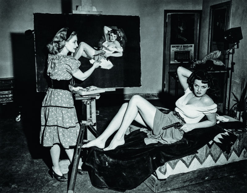
Zoe Mozert painting Jane Russell for The Outlaw film poster
In the first half of the twentieth century, the top Pin-Up artists were celebrated and famous to a degree that is unfathomable now. George Petty’s long-legged, ballet-shoe wearing Petty Girl was a virtual American national sweetheart, appearing everywhere from cigarette ads to the nose of the Memphis Belle bomber plane. In 1950 General Motors commissioned a Petty hood ornament for its Nash car and in the same year Colombia Pictures made a movie tribute The Petty Girl.

But the two artists who really stand out from the rest – and whose works now fetch six-figure sums at auction – are Alberto Vargas and Gilette ‘Gil’ Elvgren.
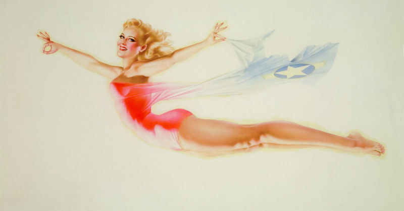
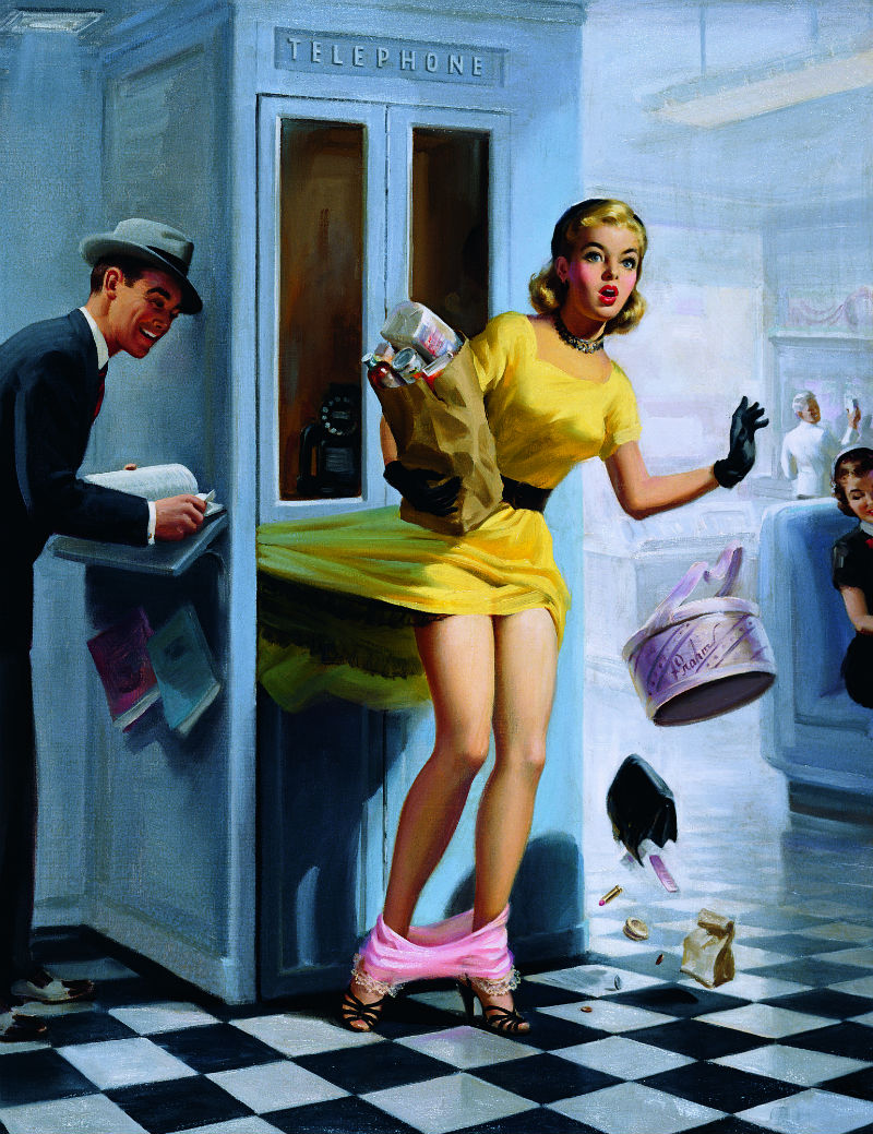
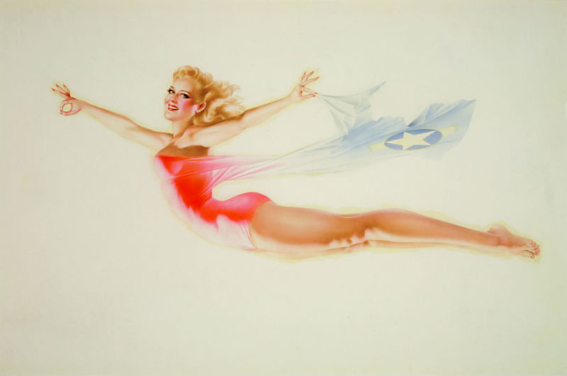
Gil Elvgren’s work is perhaps the apotheosis of the Pin-Up genre: witty, expertly crafted scenes with the just the right combination of humour, cheekiness and desirability. He apparently claimed that the ideal Pin-Up model had a 15-year-old’s face on a 20-year-old’s body, which is the sort of thing you could say in the 1940s without being thought creepy. That quote may be apocryphal but he did base most of his paintings on the model Myrna Hansen [see the book cover image, top], who started working for Elvgren when she was just 13 (chaperoned by her mother, it must be said).
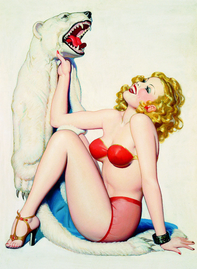
By Gil Elvgren (c) Brown & Bigelow – a rare nude
Alberto Vargas’ work, meanwhile, truly transcends the genre: beautifully-realised, idiosyncratic paintings, often funny and sometimes with a hint of mystery. They celebrate the female form in a way that has more in common with The Rokeby Venus than the Playboy centrefold. If anyone in the Pin-Up world can truly be called an artist, it’s Vargas.
By Alberto Vargas (c) the Max Vargas Collection
Alas, it was the Playboy centrefold that eventually did for Pin-Up. The craze was intense but relatively short-lived and started petering out in the mid-1950s. War veterans returned to family life and, married with children, could no longer display girls over their beds. As Hanson puts it: “once the dream girl went from the wall to the crate in the garage there was no reason to maintain her innocence.” Although Playboy magazine was ironically one of the last publications to include pin-up art, its photos of real women actually naked sounded the death knell for paintings of imaginary ones in cheeky uniforms. Pin-Up was too naughty to be put up in the family front room, but not naughty enough for the private stash.
The form fell completely out of fashion for a few decades, its superstar artists forgotten, but then began to become collectible in the 1980s and Pin-Up’s stock has continued to rise ever since. Alberto Vargas’ best paintings now sell for over $100,000, while Elvgren’s approach $300,000.
With The Art of Pin-Up TASCHEN has surely produced the definitive guide to the genre, with hundreds of high-quality images, many of them reproduced especially for the book from the original Brown and Bigelow calendar company archives. It is a stunning publication – and if you have £150 to spend on a huge collector’s pop art book, you won’t find a better bet.
The Art of Pin-Up is available to buy now from TASCHEN.


Them was the days, women still had their original mammaries (OEM,) none of this placky nonsense, an age of innocence then Bardot arrived, the French floozy. It’s all in the pout, don’t you know , the pout.
Old Benny (Benedikt Taschen) has headed for the hills, the Hollywood Hills, lives in that concrete flying saucer overlooking the valley, the one built to accommodate orgies. leaving that dreary NRW weather far behind, swapping the Rhine for rhinestone as it were. Occasionally popping back to the Hohenzollernring, checking up on the Euroflow, or torrent as it now is.
Never figured out the relationship between Taschen and the bookseller Walter Konig, HQ and flagship store on Ehrenstraße, a short far right march from Tashen’s HQ. Konig has the franchise in German museums, an ideal place for the sale of DFS priced bookish merchandise. It has led to a significant increase in employment, one-Euro people hand writing price tags, the original in black, a line struck diagonally through and the new, recently felled price in red. The phrase neatly sown up comes to mind. Neither companies have managed to break down the walls of Fortress Gerhard Richter, who keeps a very tight grip on all aspects of throughput. Try buying his catalogue raisonné for less than one thousand Euro.
Happy new year all.
Happy new year, Malty!
I can’t comment on their business modus operandii, but Taschen sure do make a blimmin’ BIG book.
sounds fantastic, I love these kinds of pictures, mainly because I love that mid-century modern painting style.
Interesting to think of the ‘meta’ ramifications of men going to war to ‘protect their women’ – it’s very atavistic isn’t it. Groups of men fighting and dying to protect their genetic resource (that is, idealised good-gened women) from skirmishing outside tribes – manifest in other posters like that WW1 one that shows germans as savage apes taking their pure women –
Fabulous images, Brit! I’m a great fan of retro-glam style – as a teenager I wore lots of Fiorucci, a clothing line where each label featured a pin-up just like these. More recently, around 2007, Fiorucci launched a range of pin-up shoes and a ‘pin-up collection’ perfume.
Ahead of the curve as ever, Susan!