The Poster King, the marvellous Edward McKnight Kauffer exhibition at The Estorick Collection, provokes some thoughts on the advertising of today.
The idea that advertising can be art became entirely uncontroversial, or at least it seemed to me, around about the time of the Guinness Surfer ad. But one wonders whether you could make the same easy judgement on the basis of the advertising we see around us today.
Now, creating advertising that qualifies as art is obviously a difficult thing to do as a leading creative type has recently pointed out:
…when we take a job we do make a sort of diabolical pact. We offer the agency our skills and in return we are granted the wherewithal and distribution mechanisms that mean our ideas can be produced quickly and beautifully and spread all over the world in the blink of an eye. We pay the price with the branding, the starbursts and the logos, the single-minded message, ‘buy this’, which makes advertising advertising. If it fails as art then it’s because it has a purpose, to sell product, where as the purpose of art remains part of its mystery.
So it seems to me that once we’re in an agency we have a choice, and it is one that some people never seem to get to grips with: we can either keep trying to make art which will fail as advertising. Or we can decide to make advertising that fails as art. I chose the second option, and I make it my business to fail better with every ad I make.
There’s something impressively stoic about aiming to fail better each time. It complements Churchill’s definition of success: the ability to go from one failure to another with no loss of enthusiasm.
However, whilst I’m no expert on advertising – and I don’t watch a lot of commercial TV (sniff) – hasn’t it been failing worse in recent years? Ben Kay, who pointed me to the piece quoted above (and who we’ve been delighted to host at The Dabbler) suspects it has:
…2011 seems to be shaping up to be year number five in the UK advertising slack streak.
But what seemed worrying a couple of years ago has now become the status quo. It’s been five years since the Gorilla put away his drumsticks. Yes, there have been a few very good ads, but nothing truly great.
And I worry that that means the spinning of the vicious circle continues: crap ads get made, the standard falls, the best ads of the year are less good, clients and creatives are less inspired, crap ads get made…
So there is absolutely no reason to stop it and anyone who tries will be a lone voice in the wilderness.
It feels a little like we’re looking out of the window at a grey rainbow and no one seems to think it’s unusual.
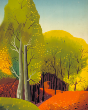
I’ve been thinking about advertising’s ‘grey rainbow’ since visiting The Poster King, the Estorick Collection’s Edward McKnight Kauffer exhibition (until 18th December). As refreshing and intriguing a collection of images as I’ve seen in recent years – and just about all of it done whilst setting out to advertise.
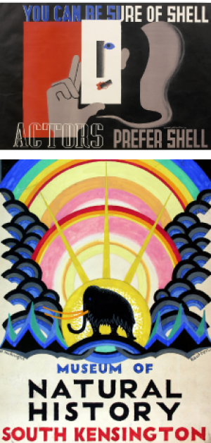
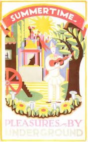
From his well-known posters for clients such as Shell-Mex and London Underground…
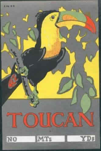
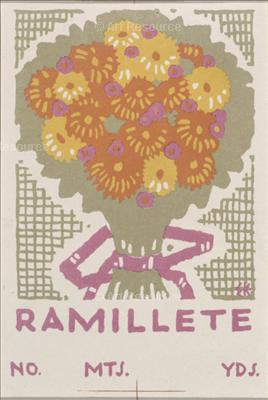
…to something that couldn’t be more disposable and peripheral, labels for cotton bales (top and below), the images really do delight.
They’re quite obviously art (you know it when you see it). It’s worth going just to see the labels.
But did McKnight Kauffer have it easy? One assumes his brief for the Tube posters was along the lines of ‘make visiting places around London look a beautiful thing to do’. Which is pretty much what, say, an Impressionist painter might have set out to do in, say, Paris – and look what they came up with.
Why isn’t more advertising created with such a brief? It’s difficult to think of more effective advertising than McKnight Kauffer’s posters – they’re still giving people good feelings about the brands that commissioned them nearly a century after they were created. Certainly, my own idea of the Tube has been influenced by its classic poster art.
The current poster advertising the cultural rewards available if you use London transport is one I see regularly (below). Is it any good as advertising? I suppose it’s fairly memorable. But it’s based on a clunky, obvious and somewhat laboured pun – aren’t Londoners a bit too sophisticated for that? And it’s never going to impart any emotional glow to London Overground.
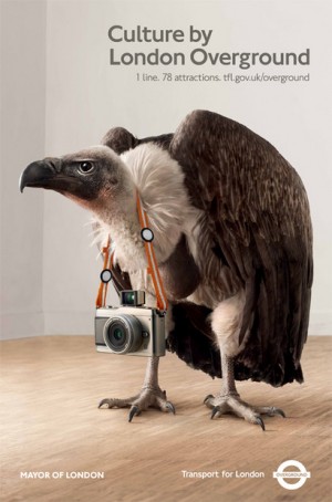
Whatever its status as advertising, it’s certainly not art. Once it comes down I doubt it will ever be looked at again.
Sure, an Edward McKnight Kauffer doesn’t come along every day. But it doesn’t look as if we’re doing much to produce one at the moment. Perhaps the squeeze on TV advertising means lavish Surfer-style films can’t be justified any more. But there seems no good reason for not hiring a graphic artist to create a poster that would inspire people to visit London’s galleries and museums.
So marketing folk, rather than settling for your ad agencies noble goal of failing better, how about encouraging them to take a few shameless, uncompromising, glorious shots at creating great art? It would get your brand noticed right now – and perhaps even for the next century or so.







thoroughly agree – and it’s a proposition upheld by the popularity of london underground and railway poster reprints. (everyone I know seems to have at least one somewhere in their house at the moment) check out the LU shop here
Some nice stuff there Gaw, peoples art, not the stuff we need an expert on hand to instruct us how to unravel.
Absolutely agree. On my sitting room wall I have a wonderful 1932 Dubonnet ad by Cassandre (http://bit.ly/b1KswM). Kauffer’s work is brilliant too. Nothing like that around now. I think half the problem with ad agencies today is that there are very people in them who can actually draw. Creative brilliance is all about coming up with ideas such as meerkats to sell insurance.
If only the NHS would take note, the local ‘practice’ waiting shed is awash with advertising, don’t….smoke, breath, drink, drive, dip your wick, sneeze, cough, lift anything, drop anything, eat meat, potatoes, sweets, kebab, especially kebab, ask awkward questions, take ill out of hours or smile at the nice obese nurse. None of it in the least eye catching.
As for effective advertising, the current thinking seems to be ‘make it as bad as possible, so bad it will become a cult’, that however is not the word that I would use to describe the ‘go compare’ creator.
There’s no financial reason not to have great stuff made in the name of advertising: print ads often cost the same no matter how shit they are, and people will often drop their fees for a ‘good’ job. But the real problem is the playing of percentages: fewer ads are granted creative ‘indulgence’ (many print ads use bought stock shots instead of commissioned work that is made specifically for the brief), so if ten ads a year are given a chance to be great then the odds of that happening are far lower than if 100 ads are given such an opportunity.
There are lots of other reasons, but it’s really the tightening of a fist, and when a fist tightens there’s little room for magic.
Every Tom, Dick and Trevor’s jumping on your bandwagon now, Ben:
http://www.thisislondon.co.uk/markets/article-23991023-ad-land-is-not-rocking-the-boat-enough.do
A refreshing lack of straplines in those arty ads. On the subject of which, I came across one today that gave me a long and (for everyone else) very irritating fit of the giggles.
Ready…
Morley and Co – “We are among the most dynamic firms of Chartered Accountants in the Swindon area”.
I’d love to know whether they gradually watered that down from, say, “We are the most dynamic firm of Chartered Accountants in the the South of England”, or whether they actually sexed it up from something even milder.
Ours was a constant source of mirth, Nelson was his name, his understrapper?..you guessed it…Hardy.
Our Previous company lawyers were called Wright Hassell
Just noticed that the cotton bale labels look great on a smart phone screen.
If anyone’s interested in getting their hands on some of Kauffer’s work, there’s a collection of the labels ( including the toucan above) on eBay right now
Thanks – I bought a couple.
Would you say that Toucan was Soane’s House yellow?
Very much so, now you mention it – when you look at the label on a phone screen it’s very close to that room when seen on a sunny day.
One of the interesting things about the exhibition is the use of colour. It’s sometimes closer to the uninhibited Victorian pleasure in strong and sometimes clashing colours than in our own ‘tasteful’ palate, where colours are only allowed to either complement or contrast.
For those interested, here’s some explanation of how cotton bale labels came to be so carefully designed:
http://johnjohnson.wordpress.com/2009/04/30/exporting-to-the-empire-labels-of-the-cotton-trade/
The Manchester Jewish cotton merchants who commissioned McKnight Kauffer’s seem an interesting lot:
http://www-art.newhall.cam.ac.uk/the-collection/by/artist/id/231/name/Isabel+Steinthal/artwork/385
the elephant label in the first link is truly excellent!
there’s also a well written and very interesting blog on the topic (of bale labels) by a serious label collector, well worth a browse –
Textile Trademarks